Carousels are a great way to showcase important information on your website. While you can create a carousel using normal HTML and CSS, it seems like re-inventing the wheel. You can create a Vue3 Carousel very easily using the vue3-carousel package.
In this post, we will look at the various options available in the vue3-carousel package.
1 – Installation
The first step is to install the vue3-carousel package in your VueJS project.
$ npm install vue3-carouselIn case you are using yarn, use the below command.
$ yarn add vue3-carouselOnce the installation is complete, we can start using the same.
2 – Basic Vue 3 Carousel Implementation
Let us first perform a very basic carousel implementation.
Below is the script part of your component.
<script setup>
import 'vue3-carousel/dist/carousel.css'
import { Carousel, Slide, Navigation } from 'vue3-carousel'

const slides = [
  { id: '1', title: 'Vue 3 Introduction', content: 'VueJS is a library' },
  { id: '2', title: 'Vue 3 Components', content: 'Know the components' },
  { id: '3', title: 'Vue 3 Conditional', content: 'Rendering Conditionally' },
  { id: '4', title: 'Vue 3 Reactivity', content: 'VueJS is Reactive' },
  { id: '5', title: 'Vue 3 Compute', content: 'VueJS uses computed properties' },
]

</script>
As you can see, we import a special CSS file available as part of the vue3-carousel package. Also, we import some packages that help us create a carousel.
Lastly, we have an array of objects by the name slides. Basically, this is the content of the carousel. For the demo, we have hard-coded the data. However, this can also come from an external source like a file or an API call.
Note that this example uses the Vue 3 Composition API approach. However, the same approach will also apply to Options API.
Below is the HTML and CSS part of the component.
<template>
  <Carousel>
    <Slide v-for="slide in slides" :key="slide.id">
      <div class="carousel__item">
        <h3>{{ slide.title }}</h3>
        <p>{{ slide.content }}</p>
      </div>
    </Slide>

    <template #addons>
      <Navigation />
    </template>
  </Carousel>
</template>

<style>
.carousel__item {
  min-height: 200px;
  width: 100%;
  background-color: var(--vc-clr-primary);
  color: var(--vc-clr-white);
  font-size: 20px;
  border-radius: 8px;
  justify-content: center;
  align-items: center;
}

.carousel__slide {
  padding: 10px;
}

.carousel__prev,
.carousel__next {
  box-sizing: content-box;
  border: 5px solid white;
}

</style>
The <Carousel> component wraps the entire component code. Also, the <Slide> component is repeated using the v-for directive. You can read more about it in this detailed post on using v-for directive in VueJS.
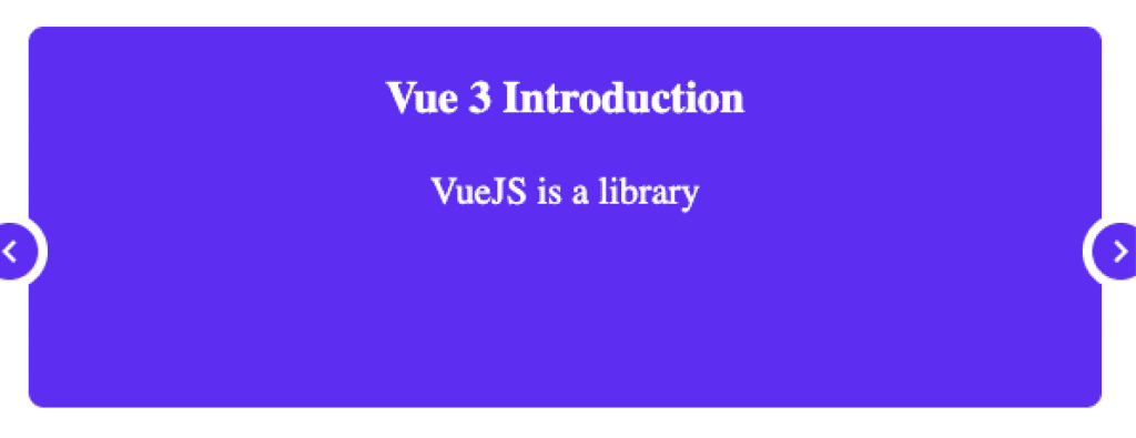
For every slide in the slides array, we have a div with the content of the slide object. Lastly, we have the addons section where we use the Navigation and Pagination components. See below screenshot for the final carousel.
The Navigation component enables the left and right arrows for moving the slides. See below screenshot:

3 – Vue 3 Carousel Pagination
To enable pagination, we have to first import the Pagination component from vue3-carousel package.
<script setup>
import 'vue3-carousel/dist/carousel.css'
import { Carousel, Slide, Pagination, Navigation } from 'vue3-carousel'

const slides = [
  { id: '1', title: 'Vue 3 Introduction', content: 'VueJS is a library' },
  { id: '2', title: 'Vue 3 Components', content: 'Know the components' },
  { id: '3', title: 'Vue 3 Conditional', content: 'Rendering Conditionally' },
  { id: '4', title: 'Vue 3 Reactivity', content: 'VueJS is Reactive' },
  { id: '5', title: 'Vue 3 Compute', content: 'VueJS uses computed properties' },
]

</script>
Then, we need to use the component within our template.
<template>
  <Carousel>
    <Slide v-for="slide in slides" :key="slide.id">
      <div class="carousel__item">
        <h3>{{ slide.title }}</h3>
        <p>{{ slide.content }}</p>
      </div>
    </Slide>

    <template #addons>
      <Navigation />
      <Pagination />
    </template>
  </Carousel>
</template>
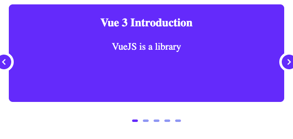
This will add the pagination feature at the bottom of our carousel. See below screenshot.

4 – Enabling Wrap-Around Carousel
We can also enable wrap-around feature in our Carousel for rotating navigation from first item to last and then, starting with the first item again.
<template>
  <Carousel :wrap-around="true">
    <Slide v-for="slide in slides" :key="slide.id">
      <div class="carousel__item">
        <h3>{{ slide.title }}</h3>
        <p>{{ slide.content }}</p>
      </div>
    </Slide>

    <template #addons>
      <Navigation />
      <Pagination />
    </template>
  </Carousel>
</template>
Basically, we set the wrap-around property to true. Note that we set the property on the Carousel component.
5 – Introducing Breakpoints in Vue 3 Carousel
Many times, we want to introduce breakpoints in our Carousel. For example, we may want to display only two slide items at a time.
The vue3-carousel package allows us to add a breakpoint object to configure the same.
To get is working, we first define the breakpoint object.
const breakpoints = {
  // 700px and up
  700: {
    itemsToShow: 2,
    snapAlign: 'center',
  },
  // 1024 and up
  1024: {
    itemsToShow: 2,
    snapAlign: 'start',
  },
}
Here, we can specify different configuration for different device resolutions. The itemsToShow property dictates the number of slides to be shown at a time.
Then, we introduce the breakpoints property to the Carousel component. See below snippet.
<template>
  <Carousel :wrap-around="true" :breakpoints="breakpoints">
    <Slide v-for="slide in slides" :key="slide.id">
      <div class="carousel__item">
        <h3>{{ slide.title }}</h3>
        <p>{{ slide.content }}</p>
      </div>
    </Slide>

    <template #addons>
      <Navigation />
      <Pagination />
    </template>
  </Carousel>
</template>
Once we start the application, we should be able to see the carousel as below:

6 – Hiding the Navigation Arrows in Carousel
We can also hide the navigation arrow in our Carousel in case there is no further slide.
This can be easily achieved by adding the CSS class as below:
.carousel__prev--in-active,
.carousel__next--in-active {
  display: none;
}
Note that the hiding the navigation arrows does not work when wrap-around is set to true. Therefore, we need to remove the wrap-around property in case we want to enable hidden arrows feature. The choice depends on your user-interface requirements.
7 – Vue 3 Carousel Autoplay Option
Another useful feature provided by vue3-carousel package is the Autoplay feature. You may have seen many websites with a constantly revolving carousel of images showing important information.
We can accomplish the same using autoplay feature. See below example:
<template>
  <Carousel :wrap-around="true" :breakpoints="breakpoints" :autoplay="2000">
    <Slide v-for="slide in slides" :key="slide.id">
      <div class="carousel__item">
        <h3>{{ slide.title }}</h3>
        <p>{{ slide.content }}</p>
      </div>
    </Slide>

    <template #addons>
      <Navigation />
      <Pagination />
    </template>
  </Carousel>
</template>
The autoplay property takes the time duration in milliseconds as input. In the above example, we have set the time for each slide to 2000 milliseconds or 2 seconds.
Conclusion
The vue3-carousel package provides a bunch of options that can help us implement a Carousel in VueJS with great ease.
In my view, we should prefer to use the package unless we have very specific customization needs.
You can play around with the Vue 3 Carousel demo on Stackblitz.
Want to explore more VueJS features? Check out this post on implementing Vue 3 Watchers with Composition API.
If you have any comments or queries about this post, please feel free to mention them in the comments section below.

3 Comments
reem hosny · 7th August 2022 at 1:39 pm
Helpful, Thanks
Saurabh Dashora · 17th August 2022 at 5:53 am
Thanks for the feedback!
Kevin · 2nd November 2022 at 3:11 pm
This was super helpful thanks! Just have one question.. lets say you used this method to make cards, and added a button to the bottom. How would you integrate vue-router so that you can direct each slide to it’s desired page when the button is clicked?