In this post, we will learn how to create Svelte components with Slots.
Many times, there is a requirement to build reusable components. Popular frameworks such as React provide a facility to do so using the concept of children elements. In Svelte, the same can be achieved using slots.
If you are new to concept of components, please refer to this post on Svelte Nested Components.
In Svelte, slots can be used to compose components. A slot can accept and render any child HTML component. This helps us avoid repetition in our code base as the consumer of our component can use slots to customize the component depending on their requirement.
1 – What is a Slot?
Let’s go through a very simple demo to understand the concept of slots.
Taking the example of the Modal component that we built in the previous post, we introduce a slot within the component as below:
<script>
    export let showModal = false;
    let isInteresting = false;
</script>

{#if showModal}
    <div class="backdrop" class:interesting={isInteresting} on:click|self>
        <div class="modal">
            <slot></slot>
        </div>
    </div>
{/if}
Now, in the App component, we can add child HTML elements while using the Modal. If you wish to know about the building of the Modal component, please refer to this post.
<script>
import Modal from './Modal.svelte'
export let name;
let showModal = false;
const toggleModal = () => {
showModal = !showModal;
}
</script>
<Modal showModal={showModal} on:click={toggleModal}>
<h3>Add a New Book</h3>
<form>
<input type="text" placeholder="title">
<input type="text" placeholder="author">
<button>Add Book</button>
</form>
</Modal>
<main>
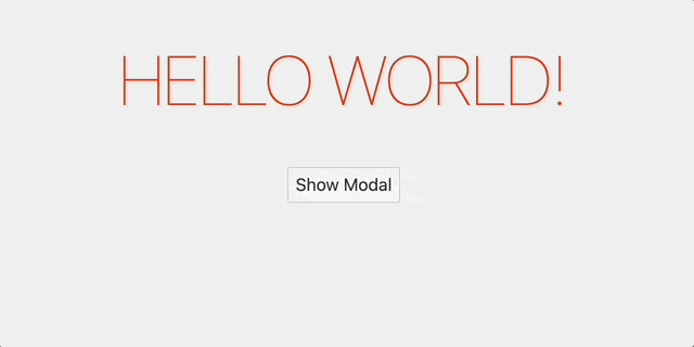
<h1>Hello {name}!</h1>
<button on:click={toggleModal}>Show Modal</button>
</main>Basically, instead of using the self-closing <Modal />, we added a bunch of HTML within the <Modal></Modal> tags to create a form. Svelte will take the HTML and inject it in the Modal component at the position where we specified the slot component.
2 – Fallback in Slots
We can also choose to have some sort of fallback in our component while using slots. This is useful when the parent component does not provide any child HTML elements.
See below example:
<script>
    export let showModal = false;
    let isInteresting = false;
</script>

{#if showModal}
    <div class="backdrop" class:interesting={isInteresting} on:click|self>
        <div class="modal">
            <slot>
                <h1>Fallback</h1>
            </slot>
        </div>
    </div>
{/if}
In the App component, we don’t pass anything.
<script>
import Modal from './Modal.svelte'
export let name;
let showModal = false;
const toggleModal = () => {
showModal = !showModal;
}
</script>
<Modal showModal={showModal} on:click={toggleModal}>
</Modal>
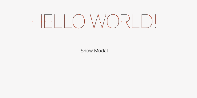
<main>
<h1>Hello {name}!</h1>
<button on:click={toggleModal}>Show Modal</button>
</main>In this case, the fallback HTML will be rendered. See below:
3 – Named Slots
We also have another feature where we can name the slots. This is very useful when we have multiple slots within our component and we want to reference them using an identifier.
Consider that we have the below as the Modal component.
<script>
    export let showModal = false;
    let isInteresting = false;
</script>

{#if showModal}
    <div class="backdrop" class:interesting={isInteresting} on:click|self>
        <div class="modal">
            <slot name="title"></slot>
            <slot></slot>
        </div>
    </div>
{/if}
This time, we specify a slot with name title.
Now, in the App component, we can use the slot name to specify the HTML child elements for that particular slot.
<script>
	import Modal from './Modal.svelte'

	export let name;

	let showModal = false;

	const toggleModal = () => {
		showModal = !showModal;
	}
</script>

<Modal showModal={showModal} on:click={toggleModal}>
	<form>
		<input type="text" placeholder="title">
		<input type="text" placeholder="author">
		<button>Add Book</button>
	</form>
	<div slot="title">
		<h3>Create a New Book</h3>
	</div>
</Modal>
<main>
	<h1>Hello {name}!</h1>
	<button on:click={toggleModal}>Show Modal</button>
</main>
The <form> element gets injected in the un-named slot position. However, the div with slot property title is injected in the appropriate slot component. Note that the order is not important while specifying the slots in the App component. The order matters only where the slot is actually rendered.
Conclusion
With this, we have learnt how to create and compose Svelte components with slots. Basically, slots are a great approach to improve the reusability of the application.
Want to learn more use-cases of slots? Check out this post where we use slots to create a custom button in Svelte.
If you have any comments or queries about this post, please feel free to mention them in the comments section below.

0 Comments