CSS is one of the most important aspects of a good user experience while building web applications. In this post, we will learn how to manage CSS in Svelte and how conditional styling in Svelte works.
1 – Setting the Project
We can quickly start with a Svelte project using a starter template.
To do so, we first install a npm package known as degit. This package basically allows us to clone a git repository without its underlying commit history.
$ npm install -g degitUsing degit, we can now grab the starter project, install the dependencies and start the application.
$ degit sveltejs/template svelte-demo-project
$ cd svelte-demo-project
$ npm install
$ npm run dev
If everything has gone fine, the application will be available on http://localhost:8080.
The starter project uses Rollup to build the application. If you are interested to know more about Rollup, you can learn how to setup a Svelte Rollup Application without the starter template. In a nutshell, Rollup is a module bundler that converts Svelte code into browser-understandable javascript.
2 – Global CSS
In Svelte, there are different ways to handle CSS. The first one is the global CSS approach.
Basically, in this approach, the CSS is defined in the global.css file in the public folder. The index.html contains a reference to the global.css file as follows:
<!DOCTYPE html>
<html lang="en">
<head>
	<meta charset='utf-8'>
	<meta name='viewport' content='width=device-width,initial-scale=1'>

	<title>Svelte app</title>

	<link rel='icon' type='image/png' href='/favicon.png'>
	<link rel='stylesheet' href='/global.css'>
	<link rel='stylesheet' href='/build/bundle.css'>

	<script defer src='/build/bundle.js'></script>
</head>

<body>
</body>
</html>
Any styles in the global.css are applicable to the entire application. This covers the main App component and all nested components within the hierarchy.
Consider the below additional CSS we have added to the global.css. This is apart from the already present CSS classes in the template project.
body {
	color: #777;
	background: #eee;
	padding: 0;
	margin: 0;
}

p {
	color: purple
}
To demonstrate this in action, we create a component (Modal.svelte) as below. It is a very simple component that just prints a message.
<script>
    let showModal = true;
</script>

{#if showModal}
    <div>
        <div>
            <p>This is a boring modal!</p>
        </div>
    </div>
{/if}
We also add this component to the App component. If interested, you can learn more about components in this detailed post about Svelte Nested Components.
<script>
	import Modal from './Modal.svelte'
	export let name;
</script>

<Modal />
<main>
	<h1>Hello {name}!</h1>
</main>

<style>
	main {
		text-align: center;
		padding: 1em;
		max-width: 240px;
		margin: 0 auto;
	}

	h1 {
		color: #ff3e00;
		text-transform: uppercase;
		font-size: 4em;
		font-weight: 100;
	}

	@media (min-width: 640px) {
		main {
			max-width: none;
		}
	}
</style>
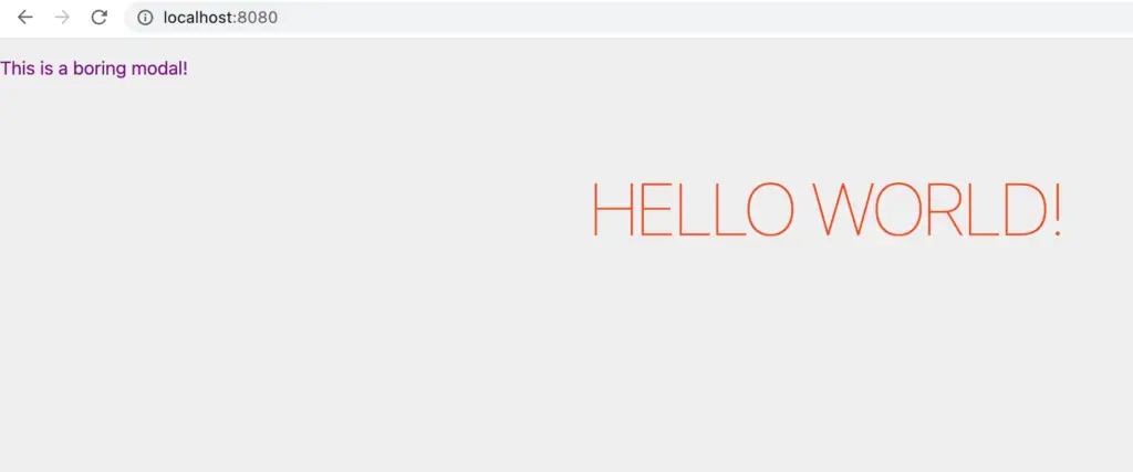
Notice that the App component has a bunch of styles of its own. However, there is nothing specific for the <p> tag. If we run the app now, we will see the screen as below:

The <p> tag has taken the color defined in the global.css.
3 – Component-Level CSS
The next type of styling supported by Svelte is at the component-level. For example, let’s consider that we want to have some individual styles for our modal in terms of its appearance.
See below the updated version.
<script>
    let showModal = true;
</script>

{#if showModal}
    <div class="backdrop">
        <div class="modal"  >
            <p>This is a boring modal!</p>
        </div>
    </div>
{/if}

<style>
    .backdrop {
        width:100%;
        height: 100%;
        position: fixed;
        background: rgba(0,0,0,0.6)
    }

    .modal {
        padding: 10px;
        border-radius: 10px;
        max-width: 400px;
        margin: 10% auto;
        text-align: center;
        background: white;
    }
</style>
This changes our modal as below:

In this case, the styles at the component-level are applied for that particular component only. This is a great benefit for developers because this feature allows developers to scope the styles for each component without risk of impacting other parts of the application.
4 – Conditional Styling in Svelte
The third type of styling supported by Svelte is conditional styling. Many times, we want to change the style for a particular DOM node based on some condition. For example, we might want to change the font color of the popup message based on some error condition.
With Svelte, we can handle such requirements with ease.
See below example:
<script>
    let showModal = true;
    let isInteresting = true;
</script>

{#if showModal}
    <div class="backdrop" class:interesting={isInteresting}>
        <div class="modal"  >
            <p>This is a boring modal!</p>
        </div>
    </div>
{/if}

<style>
    .backdrop {
        width:100%;
        height: 100%;
        position: fixed;
        background: rgba(0,0,0,0.6)
    }

    .modal {
        padding: 10px;
        border-radius: 10px;
        max-width: 400px;
        margin: 10% auto;
        text-align: center;
        background: white;
    }

    .interesting .modal {
        background: crimson;
    }

    .interesting p {
        color: white
    }
</style>
We have now updated the Modal with an additional parameter known as isInteresting. Also, we update the backdrop <div> as below:
<div class="backdrop" class:interesting={isInteresting}>Basically, this means that we want to apply the class named interesting if the value of boolean isInteresting is true. If it is false, the class will not be applied. In the <style> section, we also define the CSS class .interesting where we change the background of the modal and color of the <p> element.
After this change, the modal appears as below:

5 – Conclusion
With this, we have learnt how to manage CSS in Svelte and also conditional styling in Svelte. Svelte provides three different ways of managing CSS – global CSS, component level and conditional styling. We have covered all of them in this post with examples.
Do you want to know more applications of Svelte’s simple styling approach? Check out this post about creating a reusable tab component in Svelte.
If you have any comments and queries about this post, please feel free to mention in the comments section below.
0 Comments